How I made a Cover Art successfully for one of my clients!
- smoak4n
- Nov 18, 2021
- 3 min read
In this blog, I will describe the process of how a Cover Art was made for one of my client's upcoming singles. I will lead you through a couple of steps and curves I had to undertake to get this Cover Art finished.

(Fig1: Final Version of the Cover Art)
The Beginning
The way this whole process had started was when the client had reached out, asking me to get his Cover Art done for his upcoming single called 'Righteous'. I told him the price and he was satisfied with how cheap it was, so we started discussing ideas of what he wanted on the cover. We discussed what the song is about and we both decided to go for a romantic theme for the cover. Then he had sent me a picture of himself and his girlfriend to use in the Cover Art.
The Production
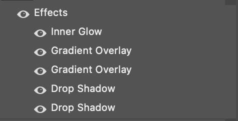
The first thing I had done was fix the levels of the image that he had sent me with Adobe Lightroom. Once that was done, I had thought of an idea to put the image into a polaroid frame and use an overlay to make it look like a real polaroid picture, shortly after I started to add more items to the image such as red roses to set the whole 'romance' theme. I put the name of the song on the polaroid picture with a handwriting font so it looks like someone had written it on. Shortly after I started blending the added pictures of the items to make them look more natural, like the items would actually be there. This was done by playing with Curves, exposure, and many other effects.
(Fig2: Effects | Fig3: Curves & Exposure.)
Once that was done I had shown the progress of the cover to my client and he was pleased with the way it was going, therefore I had added more items to the picture such as a candles and some rose petals. Once that was done, the client had asked me to add in two extra items, 'a Magnum' (an alcoholic beverage) and 'a Grinder' (an item used to grind up tobacco). By adding the images of the items in, I had to rearrange all images so everything fits and I had to change the scale of the composition from 1000px x 1000px to 2000px x 2000px to prevent images from going pixelated once sized down.
(Fig4: Previous comp scale | Fig5: New Composition scale
Once everything was in place just like the client had requested, I started to dislike the whole look of the Cover Art due to the items that the client asked me to add, I personally felt like the cover started to look bad and the 'romance' theme that I was going for just went out the window. I started a new composition that focused mainly on the polaroid image of the client and his girlfriend and the roses for the romance theme. I added bold text on the side which included the client's name and the song title. I spoke to the client about how I felt about the cover and he was really fond of the new cover idea that I had presented. The client asked for his name to be coloured in red. I had changed the colour and I replaced the 'o' with a red rose to boost the theme. The client was very satisfied with the final product. He had paid me for my work and I had sent him the Cover Art.
(The Evolution of the Cover Art)
(Click to enlarge)
Bibliography
All photos used are self made.


Comments